hey im working on a site design and i want to know how the page looks on other computers. i have a mac but designs always vary between mac and pc. the links arent supposed to work in this phase right now so dont tell me "hey when i clicked that it didnt work"... thats how its supposed to be right now. and i can see that around the link squares there are white lines... i need to work on that too.
so yeah, feedback? can everyone see the design? what else should i add?
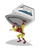
i made the little footbag in illustrator using the pen tool. its awesome cause i can just click on the panels and change them to whatever color i want.
this is the background image i created in illustrator:
this topic is open for suggestions and constructive criticism. not debates.
Last edited by PegLegHolly on 03 Mar 2007 19:44, edited 1 time in total.
she made the footbag with wings. she didnt steal it, or whatev.
its a concept. not a finished page, so its just layout shes talking about.
id put weekly meeting times, like on the contact page, and your clima 1 tutorial, and a stitching tutorial. (but that comes later) somewhere.
maybe a footbag faq, or an explanation of the sport.
were going to put our bags up on our individual pages to show, and some crazy pictures, and our equipment im sure. idlike to have our whole collection in one pic too.
bios would be cool too. but theyd pretty much match.
-music
-interests
-our fav footbag--our own
-?
a counter would be cool to see how many people check the site.
youre awesome. footbag sites are soooo cool, and now you (and maybe me) manage one. fucking sweet.
It's a very nice design
One thing about the right side though. Having that white line run down through the page and through the text. Kinda bothers my eyes.
no is not the logo of anyone. and you can clearly see that in the wings, the footbag, and the style of the artwork itself. its not a black and white image like the one you posted... and its not stencil-style art. its more of flash-art than anything.
i will be working on the site more within the next few days and there will be some large differences. i will make a new logo and post the different versions and get some feedback on those before we make any decisions as far as a logo goes.
im thinking the sillouette of tennessee with a footbag on top of nashville and a little heart behind the footbag.
other than the aesthetic aspects what are some good ideas of pages or information that we could post? what would you want most out of a footbag site? what all do you look for? what kinds of videos should there be? should there be a weekly mystery song download? shoe and equipment reviews? tutorials? we want this to be fun and not a boring black and white website that you only visit once.
no that post wasnt jerk-like. graphic designers need honest critiques or else theyll release a design and something goes horribly wrong. i already knew about that logo cause i saw that josh raye had that shirt on when we went to midwesterns (i think it was him). but footbags with wings is a common thing among the community. either way it will change because al had a better idea of making it more about nashville. ill be working on the site more this weekend so keep the ideas coming.
hey people, i have changed the design of the nashville footbag brigade website. i also have added to the members section and to the footbags section. the kingston link will be removed and replaced with something else, its just a place holder right now.
i designed everything for this website by myself. im sure it looks different on pcs, so for you people with internet explorer i will need a screen shot of what the site looks like to you, please.