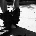
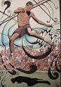
digital ink jet transfer. ( printed a pic on some label paper(you get a textured result), transfered onto good paper, all coloring and stuff was added.)
Ashley Danowski
"As a well spent day brings happy sleep, so life well spent brings happy death."
I breed rats....and I sold the babies. Heres a picture of one of the babies, they were fucking awesome. Oh, and I don't know where the original picture is. This was with a photoshop filter. It still looks good.
heres a video i made thats a time lapse of my last drawing. theres a bout nine hours time lapsed in the video. the drawing is done but unfortuanately i couldnt film all of it and i dont have a picture of the final thing
That looks spectacular Ashley! What feedback are you looking for exactly? I don't really know what you'd like the finished product to be. But so far it looks superb.
1. The head seems a bit small. It's an easy enough fix, if you feel like you want to.
2. The far leg seems a bit contorted, I can't really think of a way to fix that - but I'm sure you can.
3. Some parts are left a bit undetailed - it looks kinda like a WIP (is it?)
Overall, it looks very nice. The shading is really great on it. Pastel?
Jay (8:06:01 PM): Bu-bu-buu-buug--Looks up, and the feeling goes away like a sneeze-bu-buuuh-BULLLSHITTT
Jay (8:06:14 PM): *wipes bellybutton*
from what i see, ashley... you took a photograph and did some nice artwork on top of it.
if it were me, i would do more of the washed colors for the background... since cool colors fade into backgrounds, and warm colors come foward... (brown is a warm color)... also i would make the tree a little more obvious, but not so obvious that it competes with your beautiful figure.
other than that i think its beautiful... i dont know why but the highlight on the shoulder is really elegant. great job! i can see why youre an art student
I'm bored at work, so I'll critique your piece as well (hope you don't mind).
One thing to keep in mind is that the eye is usually first drawn to areas with the most contrast. In this case its right at the bottom - the black shadow over a white background. Secondary high-contrast areas are created by the hex strings (or whatever you want to call them). When composing an image, you have to decide what the viewer should be looking at first, then second, third, fouth and so on.
If it was me (who is more concerned with shape, form, and the illusion of depth, than abstract shapes), I would want the viewer to be most interrested in the figure's head/shoulder or the dexing knee. Those two areas are where the action is.
You might consider pushing the highlights and shadows in the figure a bit, as well as reducing some of the extreme contrast areas in the background.
Another thing you might want to consider is the placement of the figure. I would like to see her moved more to the left side. As it appears she is jumping and leaning forward it would be nice to give her some place to 'land'. The figure's head, right arm and leg are also all pointing diagonally down and off page - which is not so good. Moving the figure left will solve this problem. Also, generally speaking, compositions aren't as exciting when the focus object is dead centre.
Uhh, thats all I can think of for now. I like what you're doing with the oil pastel. Have you considered working larger? Pastel is a bitch for little details.