New Australian footbag organisation logo - your thoughts?

General footbag-related topics that don't fit elsewhere go in here.
User avatar
King Monkey
Post Master General
Posts: 2745
Joined: 18 May 2003 04:39
Location: Sydney, Australia

New Australian footbag organisation logo - your thoughts?

Post by King Monkey »

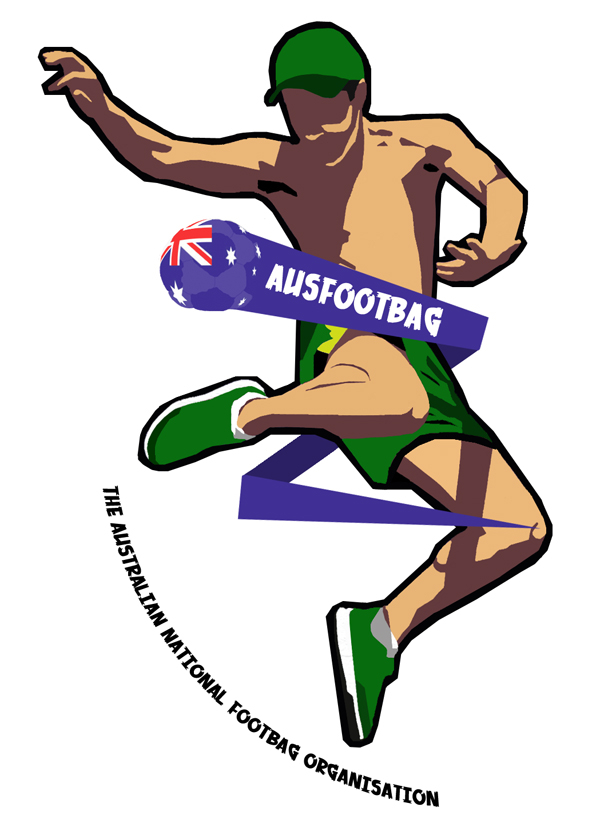
The Australian National Footbag Organisation (Ausfootbag) is in the process of redesigning its logo for a more up-to-date, fresh and representative look. It became my pet project basically and here is the final draft:

Image

Does anyone have any thoughts, criticisms, anything they would like to share on this? My personal sticking points now are what font to use, what actual wording will be used, and the placement of the wording. Some of this will only be answerable by Aussies, but i thought id question the international perspective too.

Fire away.
Ian Pritchard - http://www.ausfootbag.org

'People, just play Footbag and stop being dickheads!' - Michał Biarda
hacksterbator
Washed-Up Child Star
Posts: 4141
Joined: 12 Jul 2003 18:33
Location: Winterpeg, Manisnowba
Contact:

Post by hacksterbator »

personaly, i think that's alot of stuff for a logo. when i think logo, i think small and simple. it just seems too busy to me. i'd rather see something more straight forward. flying bag with flag, text directly underneath it, no curvy font, no jumping guy. i'm also thinking about things like letter heads, business cards, etc. where you'll have limited space and getting all that in there with the text being readable will be problematic. As will printing, as you have a lot of colours in there: 2 purples, 2 skin tones, 2 greens, red, yellow, grey and black. 10 colours seems like alot of for just a logo, where i'd expect to have about 3 or 4. As a t-shirt design i think it's pretty cool (and if you are making any please let me know) and i think it would also look good as the opening page to a web site or something similar, but as a logo to be commonly used to represent your organization i think it's over the top.
Call me old-fashioned :oops:
A.G.
User avatar
SlashC
Egyptian Footgod
Posts: 1405
Joined: 24 Jan 2004 16:58
Contact:

Post by SlashC »

I like how the bag zips around his body. Just curious, is that a whirl or a reverse whirl?
Rory "Tophat" Dawson

---

"You can ask a stranger, my legs is fast and danger!"
User avatar
sen
Post Master General
Posts: 2648
Joined: 08 Mar 2003 19:29
Location: Coaldale, AB, CA
Contact:

Post by sen »

I have to agree with Andrew.

While I really like and think it's a sweet picture, it really seems like too much for a logo.

Just my thoughts. Great job on making it. It looks cool.
Muffinman
the gimp
Posts: 10375
Joined: 21 Apr 2002 15:34
Location: Canada
Contact:

Post by Muffinman »

The font is really weak. You should either use a really subtle stock font or create your own. The font kind of screams "I DOWNLOADED THIS OFF OF FREEFONTS.COM" or whatever.

You spelled organization wrong (or is that the Australian spelling?).

It definitely should be way more simple. A logo should say a lot with very little. It should look just as powerful at an inch squared as at 5 metres squared. So for this purpose you want to avoid using line work and try to focus on "shapes" that won't distort with resizing.


The picture is cool, but a good logo would be the little Australia-flag bag by itself maybe with some text incorporated into it (to me, the bag by itself says as much or more than the entire picture as a whole...). Although something higher-contrast is important too. Something that stands out.

Also, if you're going to keep this design then I would also suggest to change the bottom text. It sort of... creates a space and feel contrary to the movement of the figure. By curving like that it creates an invisible circle area that the rest of the image now has to try to conform to, but can't because it's unevenly balanced outside of it. The text should go with the figure, which is, like, the majority of the space. It would look good to go with the movement of the little streak, but then again you're cramming too much into it.
zach4th
Fearless
Posts: 612
Joined: 17 Oct 2005 14:40

Post by zach4th »

Make the shorts longer so you can see the yellow stripe on the persons right lower thigh!!
Zach Forth
Frank_Sinatra
Avenging Disco Godfather
Posts: 1660
Joined: 09 Jan 2007 12:43
Location: Chicago, IL

Post by Frank_Sinatra »

Maybe its just me, but I think the figure's left hand should be palm down.
User avatar
Moxie
Taphophile
Posts: 3610
Joined: 13 Jul 2004 09:46
Location: USA

Post by Moxie »

Naw, they're trying to really represent the AusFootbag style with the logo. Don't worry guys, there's nothing wrong with monkey claw.


:o
"I contend we are both atheists, I just believe in one fewer god than you do. When you understand why you dismiss all the other possible gods, you will understand why I dismiss yours."

Emily Kulczyk
bdams19
Atomsmashasaurus Dex
Posts: 787
Joined: 02 Jul 2007 20:31
Location: hoboken / nyc

Post by bdams19 »

Moxie wrote:Naw, they're trying to really represent the AusFootbag style with the logo. Don't worry guys, there's nothing wrong with monkey claw.

:o
ouch, guess you watch flight of the concords too haha
Brian Damato
My Blog
NYFA
dyalander
Atomsmashasaurus Dex
Posts: 980
Joined: 05 Sep 2005 22:25
Location: Sydney
Contact:

Post by dyalander »

Flight of the concords are New Zealanders, and while we in oz have rich tradition of claiming NZer's as Australians, some (it'd probably be fair to say a lot) of them have an intense dislike of Australia and would not like being mistakenly called Australian. Just thought I'd let you know just in case you ever met a NZer, it might save you getting punched in the head.
Who wears short shorts?
Dylan Govender.
Guest_1
BSOS Beast
Posts: 471
Joined: 24 Aug 2006 21:15
Location: Minneapolis, MN

Post by Guest_1 »

I think it's perfect!

I think the hack should be even more defined!
User avatar
Will Digges
Egyptian Footgod
Posts: 1382
Joined: 15 Nov 2004 19:40
Location: USA, Ballston Lake, NY

Post by Will Digges »

You should include - "Australian for footbag."

those are my only thoughts.

(Like fosters, australian for beer.) :lol:
Will Digges

Embassy Footbag Crew
User avatar
Jeremy
"Really unneccesary"
Posts: 10178
Joined: 08 Jan 2003 00:20
Location: Tasmania

Post by Jeremy »

Pretty sure nobody from Australia got that joke since Fosters is pretty much just an export beer, nobody here actually drinks it, or even sells it.
User avatar
Cope
Shredalicious
Posts: 79
Joined: 20 May 2007 22:36

Post by Cope »

We used to sell it at the golfie, well we stocked it anyway. I dont remember actually selling any.
Nathan Cope
User avatar
Jeremy
"Really unneccesary"
Posts: 10178
Joined: 08 Jan 2003 00:20
Location: Tasmania

Post by Jeremy »

Yeah tourist places sell it a lot :P
janis
Post Master General
Posts: 2707
Joined: 29 Dec 2005 18:46
Location: Australia

Post by janis »

Jeremy wrote:Yeah tourist places sell it a lot :P
LOL!
User avatar
King Monkey
Post Master General
Posts: 2745
Joined: 18 May 2003 04:39
Location: Sydney, Australia

Post by King Monkey »

Thanks everyone for your feedback! I didnt post as i thought it would kill the conversation so i just watched other posts. I wont respond to them all now, except to post a closer-to-final-version which we have reached through discussion on the Aussie forum. Its much more plain, far fewer colours, but the basic shape is there. No decision on font and text yet though.


Image
Ian Pritchard - http://www.ausfootbag.org

'People, just play Footbag and stop being dickheads!' - Michał Biarda
JoshC.
Multidex Master
Posts: 219
Joined: 19 May 2008 11:58
Location: East Greenbush, NY

Post by JoshC. »

That looks like a big improvement from the last. I think that it would look really cool if the guy was a sillouette (if thats how you spell it). The bag could be white with a black outline and black panels, and the banner could be a white outline across the black guy, with white writing inside the banner. Or the bag could be colored and everything else black and white.
All the colored parts that are on the logo now (the green and gray and white) would be black. And the black outline on the logo you have now would be white so the features would be defined and not look like a black blob.
Just my idea. I think it would be a lot simpler that way. Good luck!
User avatar
Asmus
Ass Moose
Posts: 3780
Joined: 13 Jun 2004 08:18
Location: Copenhagen
Contact:

Post by Asmus »

Way too heavy black outline. It really kills the depth of the graphic.

Other than that I really like how this looks.
User avatar
Zac Miley
Post Master General
Posts: 5953
Joined: 04 Jun 2006 12:11
Location: Kansas City, MO
Contact:

Post by Zac Miley »

I agree with Asmus, and I also think that if you want the footbag to be a focal point you need more contrast within it. Some black lines in there would probably work.
Jay (8:06:01 PM): Bu-bu-buu-buug--Looks up, and the feeling goes away like a sneeze-bu-buuuh-BULLLSHITTT
Jay (8:06:14 PM): *wipes bellybutton*
Post Reply