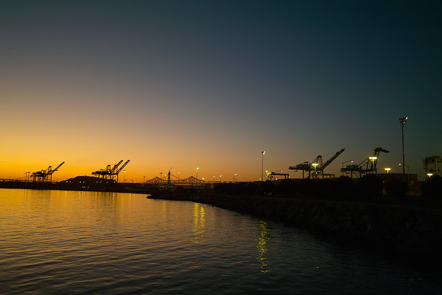
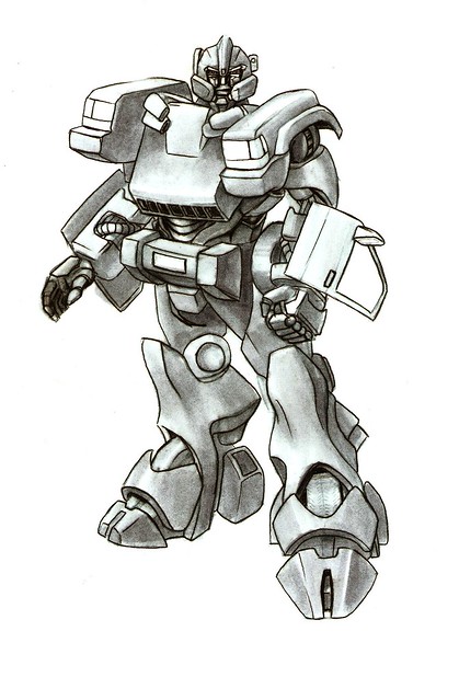
Transformer_004 by airzeke, on Flickr
Sketch for my nieces based on their daddy's 98 Jeep Cherokee. Freehand with pencil and marker. I'm never mentioning transformers around them again
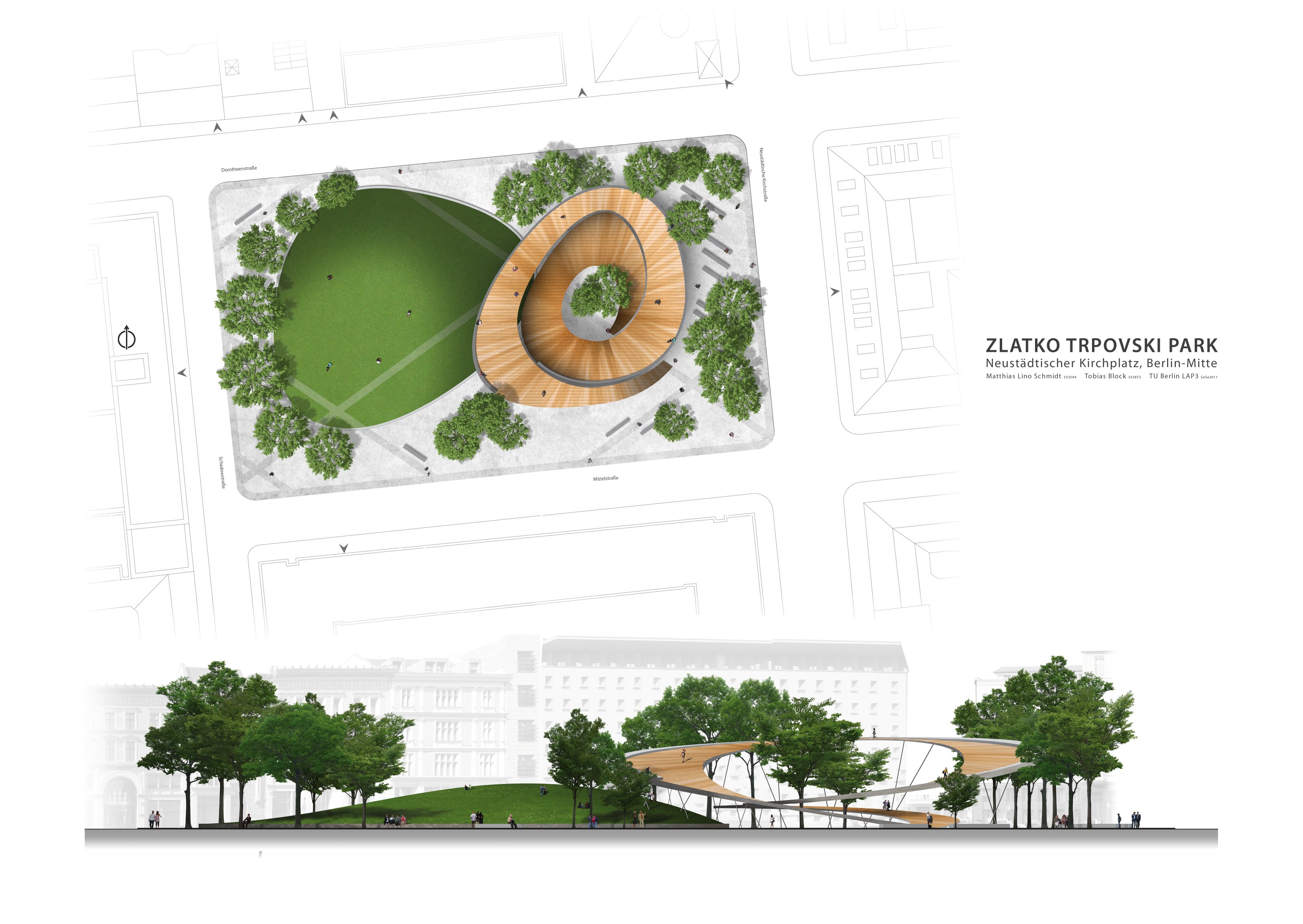
the top of that path/bridge thing would be a sick shred spot!!LinoSphere wrote:since this thread is rather dead at the moment, i'm gonna try and revive it.
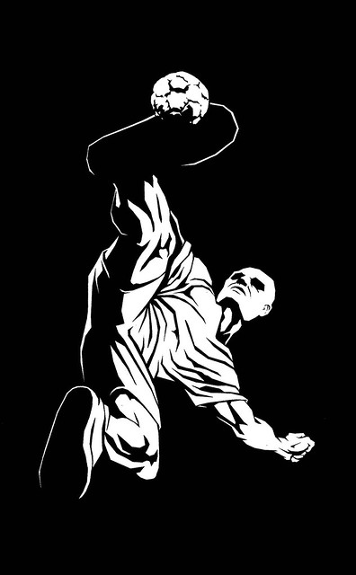
here's a design i did for a square in berlin (all hypothetical uni work, not going to be realized...)
click to enlarge!

 i made many squares to get the proportions down
 Sounds good to me. I use mechanical pencils, but use 'B' lead only. And an HB one of these guys: http://www.artistsupplysource.com/produ ... MgodRyQAKAakalazou wrote:1. yes i meant pencil, from 2H to 8B, my best friend so far is 2B
The pencil hardness really only has a small amount to do with how dark the tone is - 2b can make a mark just as dark as an 8b (and I think makes them much cleaner), it just takes a little more effort. 2b can also be just as soft as a 2h, but you have to be gentle. What I meant was figuring out where your lightest tones are and doing a very soft layer, almost indiscernible from white, in those areas. Then, figure out the next darkest area and go over that with another layer. An easier way that I mentioned was to do a darker layer, then using a kneaded eraser to erase them instead of painstakingly making these lighter areas.akalazou wrote:3. true i used a kleenex for the the shading, i never had any class/lesson for drawing so i try some things and sometimes i works, sometimes it doesn't, i even tried a Q-Tips. I'm not sure if i understand how to make layers for shading ... do you start with i.e. 2H and then move unto a darker tone ? or do you use something like 4B and make a pale big area, make another layer smaller but still with that 4B and it goes on that way ?
You don't need to change, but I would suggest some bristol paper. It's what I use for smaller pencil drawings. If you're interested in doing bigger drawings or want some really good paper, Arches 240lb hot press is probably the best paper in the world, and then Stonehenge is pretty good as well. http://www.jerrysartarama.com/discount- ... MgodTTcAnQakalazou wrote:4. my paper is Canson, Acrylic/Watercolor/Pen and Pencil, 9"x12", 98 lb. should i change ??
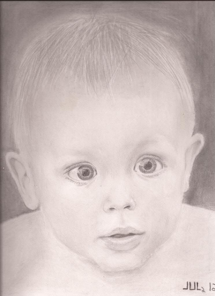
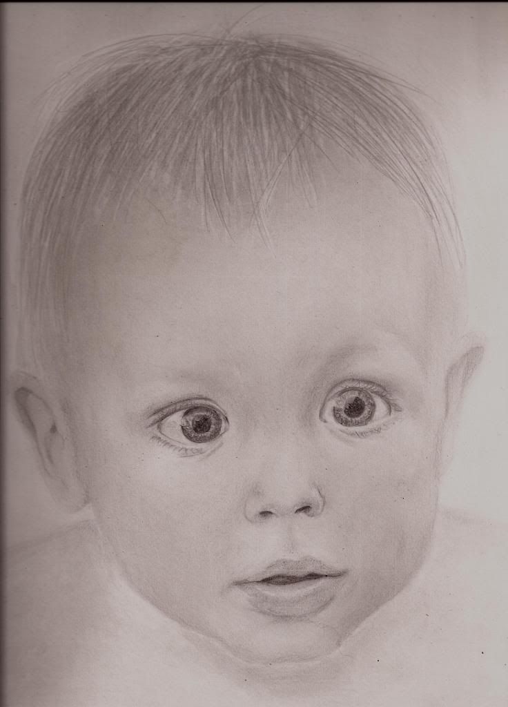
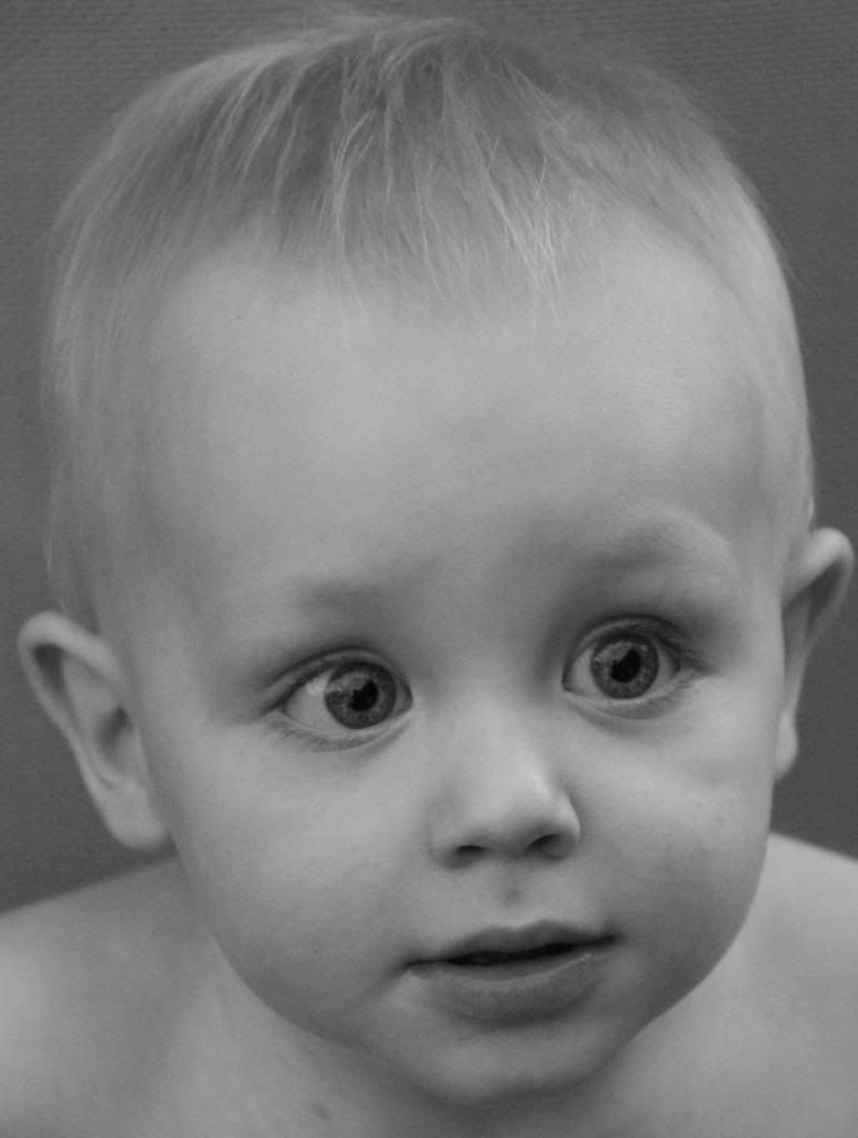
This may sound a bit theatrical/dramatic/impossible, but everything in any image is giving you the same information, but with very small nuances. Just because something exists in a certain way physically, does not mean that it is represented that way visually. What you did is logical, but it is not the result you're looking for. Even in that drawing you posted by Paul Cadden, you can see the difference between his hair and yours - every value is in relation to another value, and the hair is not described by line.akalazou wrote:5. i didnt know whow to make blond air, so i tried to make different tones of skin, then erase some and then go back and trace some lines over the erased parts. So it make like 3 tones some the hair. i also put some grey/shadow all around the head so we could see the blond hair over his head. i don't know how else i could of manage to do that.
I believe there is 9b, but you don't need it. More layers of graphite to smooth out the surface of the darkest areas is what you need, I think.akalazou wrote:6. i'll try it, my darker spots are at 7B. is there any pencil darker than 8B ??
I would suggest making the line blend more into the shadow underneath the chin in that case, but I also think the whole area underneath the head could get darker. Photographs can do things that drawings can't, but it works the opposite way as well - you don't always have to trust the photograph. If the drawing doesn't look right, but looks like the photograph, then that may mean there is an easier or better way to do it than what the photograph is doing.akalazou wrote:7. i know about that area but when i look at the picture, there is a lighter line (light reflected from the body) so i erased ... the tone is moslty the same and i'm "scared" to make it the same and lose the jaw line.
 )
)