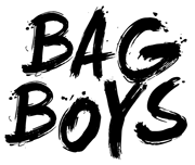
1) New logo by Aaron Price akprice
Holly won't be completing the logo as planned. Her time was very much appreciated
 Aaron Price took over and delivered a great logo. The bag panel motif, the m forming a stitch, tying things together; it's simple and says a lot. It works in so many ways I even see the profile of a shoe, with the m being the laces.
2) Grid view home page
List view will come back as an option, but I think listing the forums as a top-down hierarchy keyed by post counts does each forum a disservice. The grid allows you to see more forums, placing less importance on order. I've removed the verbose descriptions, but those will come back someplace, at some point soon. I think the names stand on their own, mostly.
3) Loss of iconography (using color more effectively)
I've removed the default icon for forums for being visual clutter. Instead, red links are used to denote an unread thread. I've been moving in this direction for some time now. Locked icons and others still appear.
4) The Slider
This has been in the projects forum for some time now, and the banners themselves have mostly already been on the forum in the past, just never in this slider format, and not with the videos intermixed.
5) The Background Pattern
This will change. Regularly. Different patterns will rotate through on a "as I feel like it" basis
 Starting with the wood.
This isn't ready for primetime just yet. I am still working on this. Slowly. But at some point soon, it's likely that this will be the default theme.
Thoughts?